

Design Diaries; Working With Colour
by Aman Than
In case you haven’t noticed, I love working with colour. But not just any colour, and certainly not a single colour. Colours and their infinite combinations are pure magic, with their consummate capacity to change a vibe and create a mood. Beyond that, colour has even been shown to have a physiological impact on its beholder. Nothing else has the power to do that.
So, why do people shy away from the bold and the beautiful? Regardless of your unique style preferences or your comfort level, there are ways to incorporate colour into your home, without stepping out of your comfort zone.
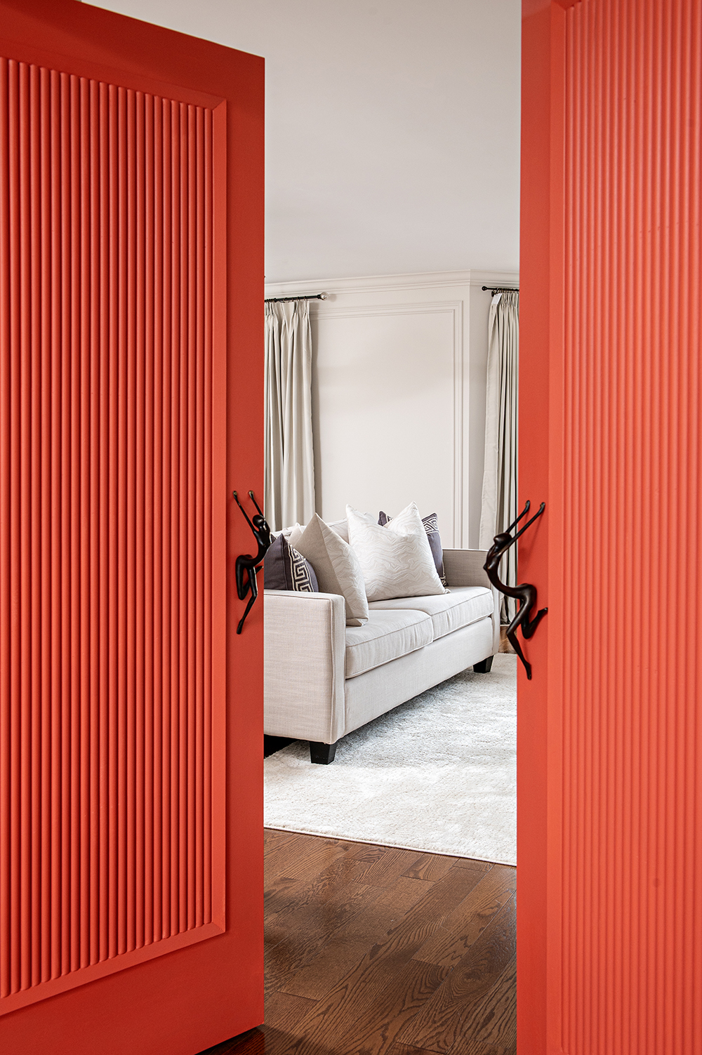
Red is energetic, exciting and passionate, making it ideal for social and stimulating spaces like living rooms, dining areas and interactive environments.
Red is energetic, exciting and passionate, making it ideal for social and stimulating spaces like living rooms, dining areas and interactive environments.
Blue is calming and serene and has been shown to lower blood pressure and slow respiration, making it perfect for bedrooms and bathrooms.
Yellow is the colour of happiness and optimism, evoking warmth and cheerfulness in a room. However, use it in moderation, as excessive use can cause anxiety.
Green is the colour of nature and is balanced and grounding. It's also versatile and adaptable in almost any room.
Purple is luxurious, deep and dramatic, and has been associated with creativity, ideal for a home office or workspace, or where a touch of elegance is desired, like the dining room or a bedroom.
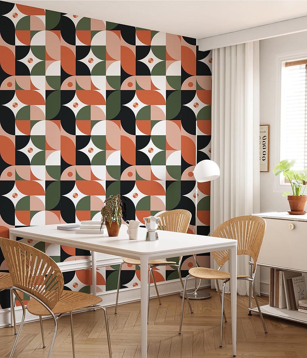
Very importantly, remember that no colour can stand alone, so view colour in combinations. When paired with black or white, a colour will naturally “pop.” You can achieve a similar, though toned-down, effect with neutrals such as off-white and grey. If you’re aiming for high contrast, pair your chosen colour with its opposite on the colour wheel, such as purple with yellow. On the other hand, colours that appear adjacent to the colour wheel are soothing and harmonious, such as purple with blue.
Start small. Colour can be overwhelming, and the sheer volume and range of choices can lead to colour confusion. My advice is to work with a manageable number of colours – three. A colour palette for a room needs no more than that. Furthermore, stick to the same colour temperature. Warm colours have yellow, orange and red undertones, while cool colours lean toward blues, greens and purples. A consistent temperature preserves harmony and achieves a cohesive aesthetic throughout. To that point, consider how your chosen colours interact as you transition between rooms, particularly in spaces that are visually connected, like the kitchen, living area and dining room.
A simple rule: Now that you have your colour trio, apply the 60-30-10 rule. According to this rule, the dominant colour occupies 60 percent of the visual area in your space, so larger-scale elements like walls and flooring. The dominant selection is often a neutral colour, but it doesn’t have to be. The secondary colour accounts for 30 percent of the space, on mid-sized elements such as sofas, armchairs and feature walls. Finally, the accent colour takes the remaining 10 percent and is often a bold choice that becomes a focal point in elements like artwork and accessories.
When working with colour, it doesn’t always pay to play it safe. There’s a time and place to go outside the comfort zone. Small and enclosed areas, like a powder room or office, can handle a bold colour choice without disrupting the balance in the home. Infuse personality into your space by introducing vibrant accents such as throw pillows, artwork, and rugs strategically placed to enliven without overpowering. Establish a cohesive narrative by repeating specific accent colours or patterns across different rooms, ensuring consistent motifs throughout your home. Colour is one of my favourite design tools, and the possibilities are endless. Keep an open mind, your eyes on the prize (i.e. your goal for the space), and these rules on hand, and explore the rainbow with confidence.